Fury's Portfolio
Main HUD
Plan for Consolidating Features to Streamline Experience

Step 0. Status Quo
This screen is full to bursting with buttons. A new player would be overwhelmed. So I want to fix that by consolidating similar features together in intuitive ways. I don't want to change everything all at once, though, or I'll startle the player base. Let's roll out one change at a time based on priority.
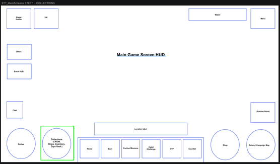
Step 1. Collections
This game is primarily a character-collector, which means the things we're collecting should be in the most accessible position. I want to consolidate them all in one place before moving them in the final step.
Step 2. DAILIES and PROFILE
There are some features mixed up in the player profile and the daily activity panel, so we can straighten that out in this step.
Step 3. STORE and VOYAGES
Consolidating all the places you buy things into one place where the most standard store used to be frees the upper left of the HUD to include a late-game feature that was in a spot completely unrelated to its purpose.
Step 4. SOCIAL and CENTRAL
Consolidate the central console, the "Command Deck," to only contain the primary gameplay modes of the game, and move that most important button, Collections, to the prime spot, the lower right corner.
And there we have it! Much cleaner.
HUD Overhaul.
Each step involved the implementation and addition of a foldout menu, like below


